
Fascinating charts
I found the below charts extremely interesting and had to share!
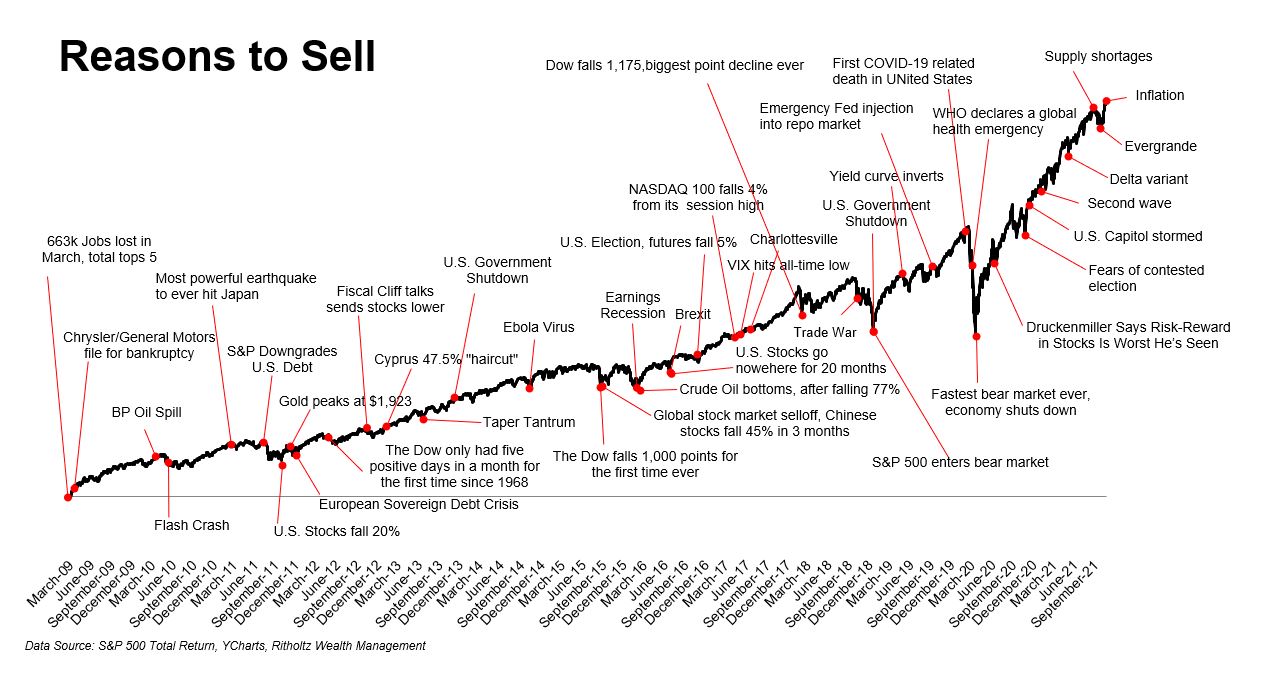
1. Chart of the S&P500 Total Return Index, which shows all the “reasons to sell” since the GFC. To me it illustrates how focusing on short-term “noise” is not beneficial to your long-term investing goals.
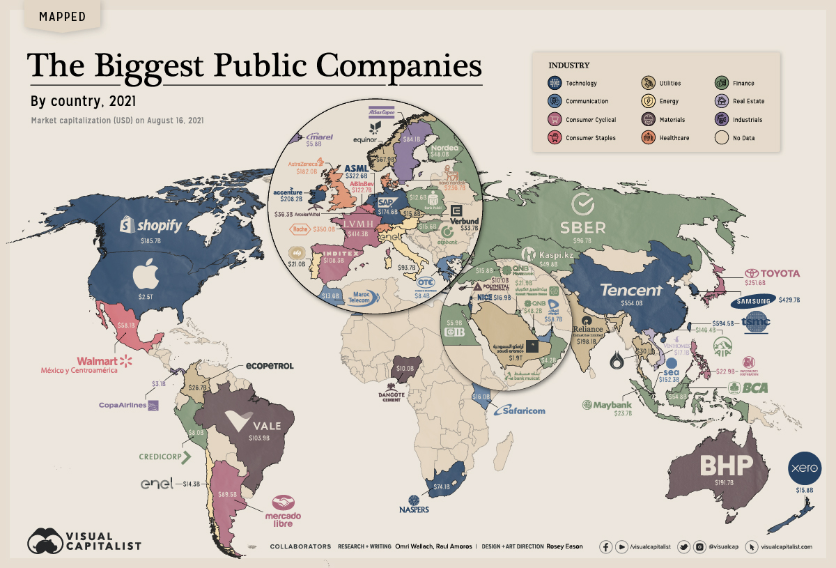
2. This graphic shows the biggest public companies in 60 countries around the world. Further information: https://www.visualcapitalist.com/mapping-the-biggest-companies-by-market-cap-in-60-countries/
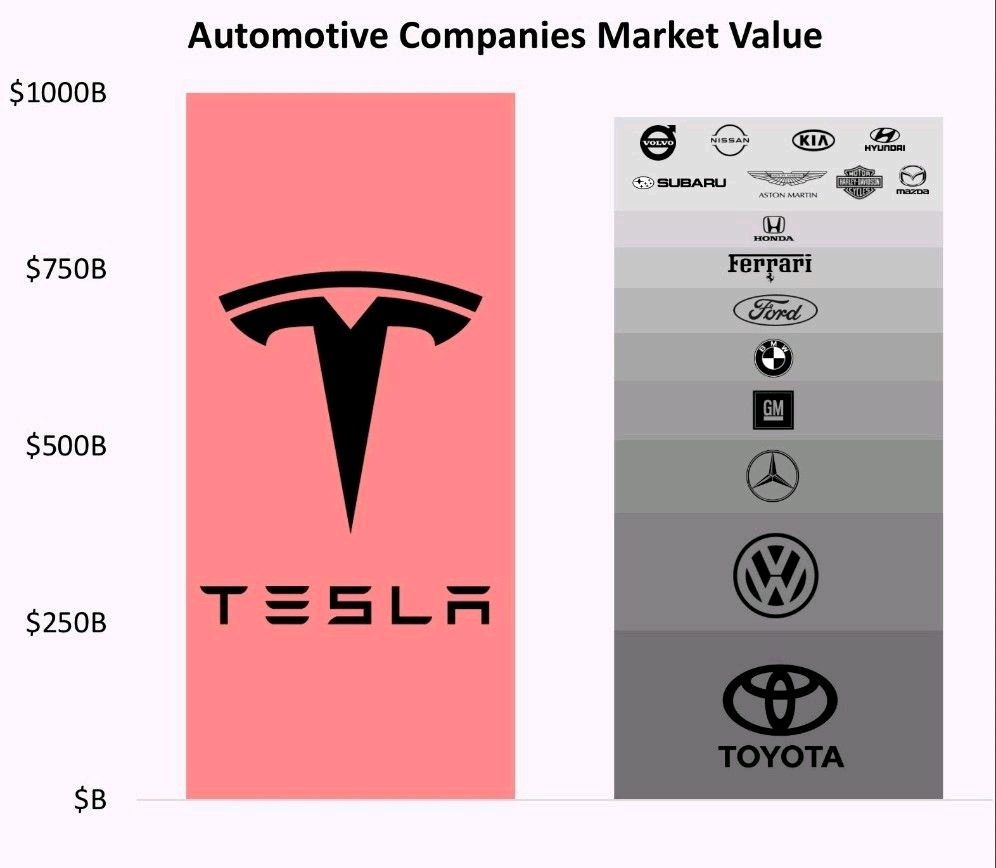
3. This graphic illustrates the market cap (value) of Tesla compared to other car makers. As you can see, Tesla is now worth more than the next 10-12 biggest car makers combined! Is Tesla’s current valuation ridiculously high, or is Elon Musk destined to be the world richest person for decades to come?
Please click on the pictures to enlarge.
— Scott Smith